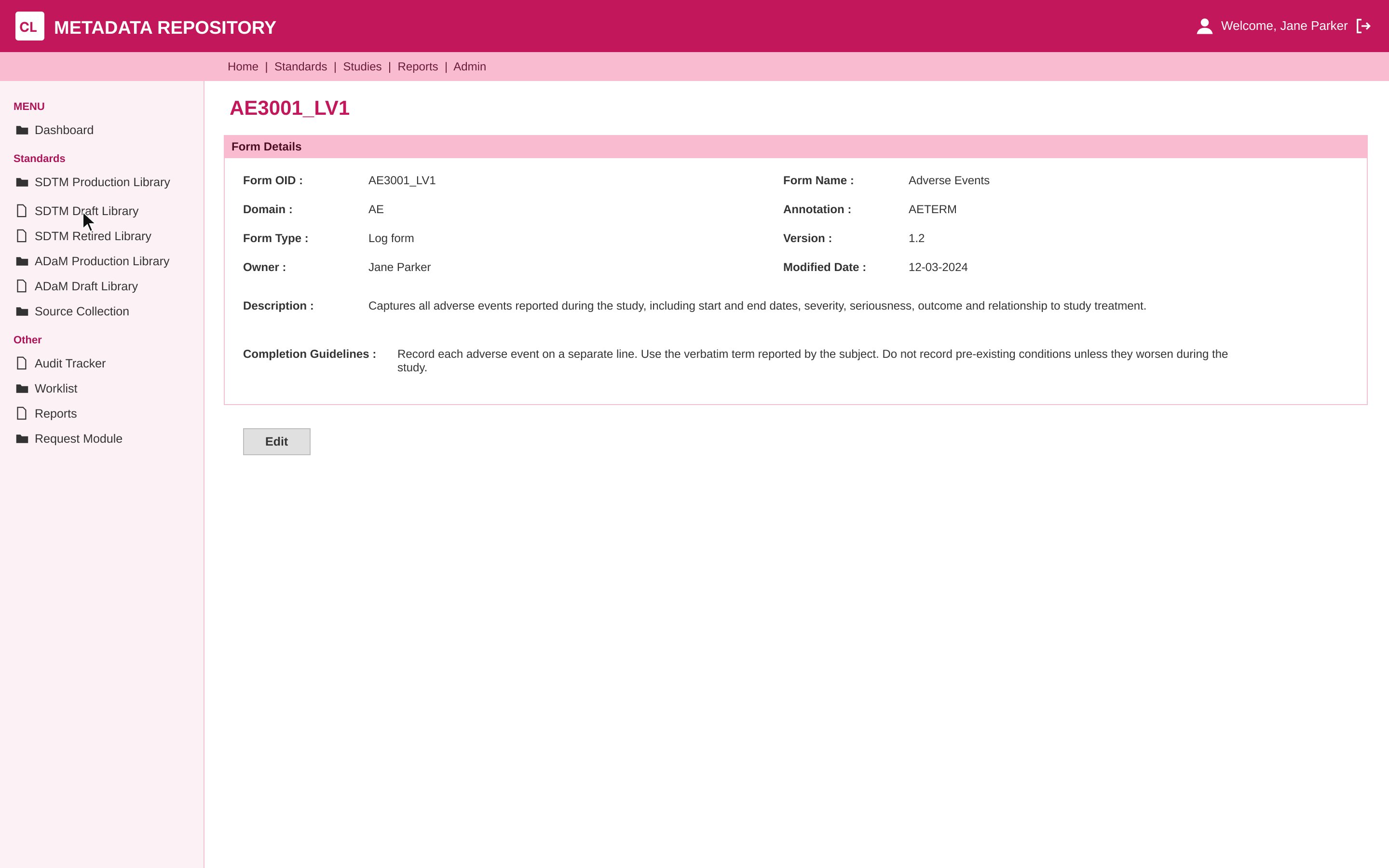
One structure, every module
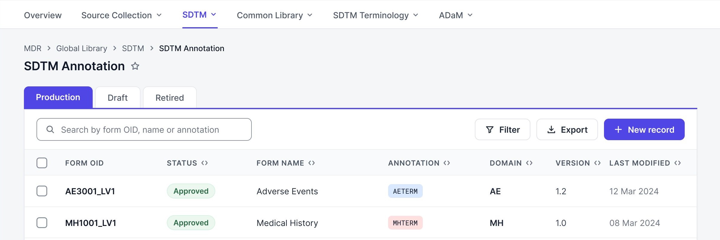
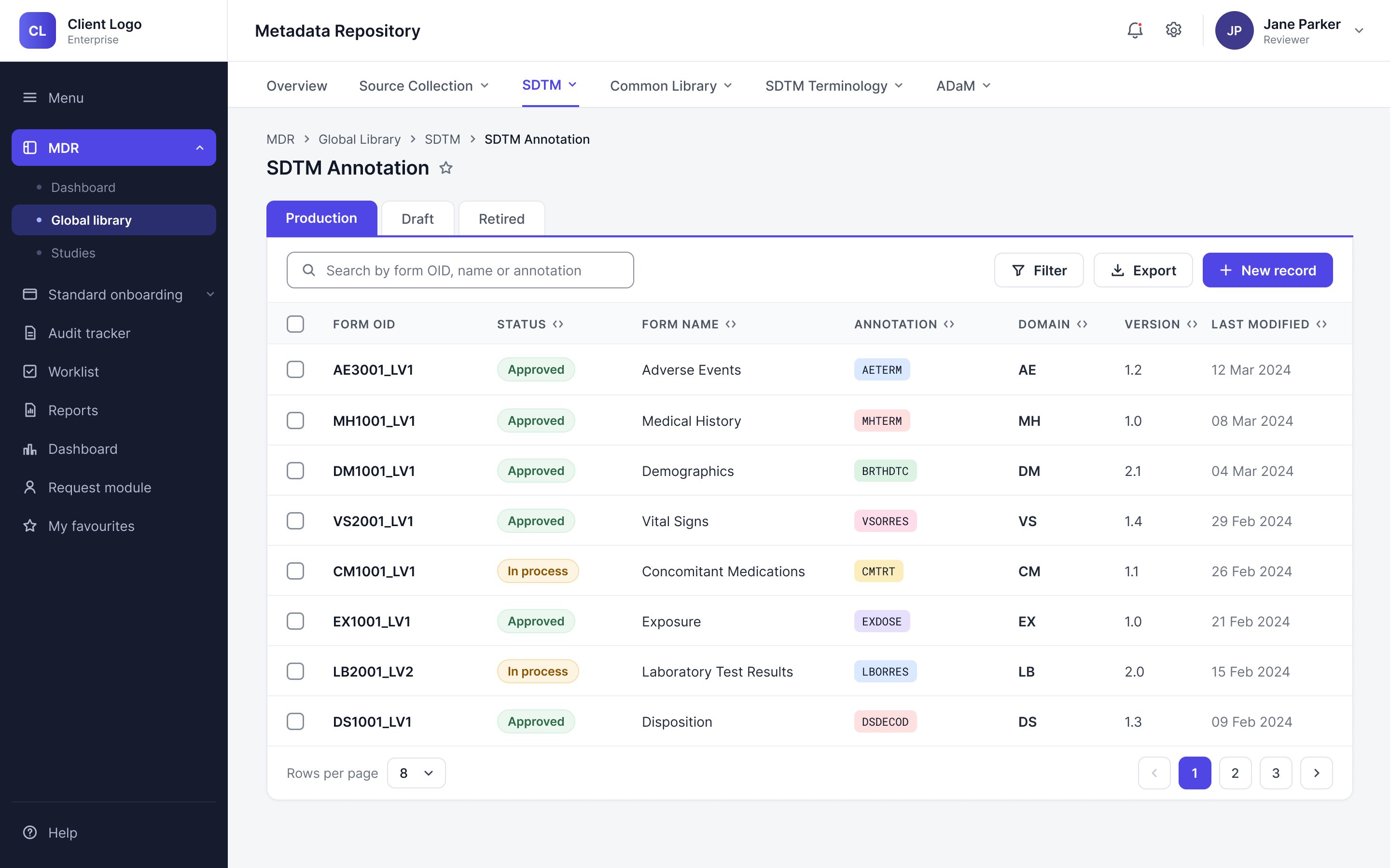
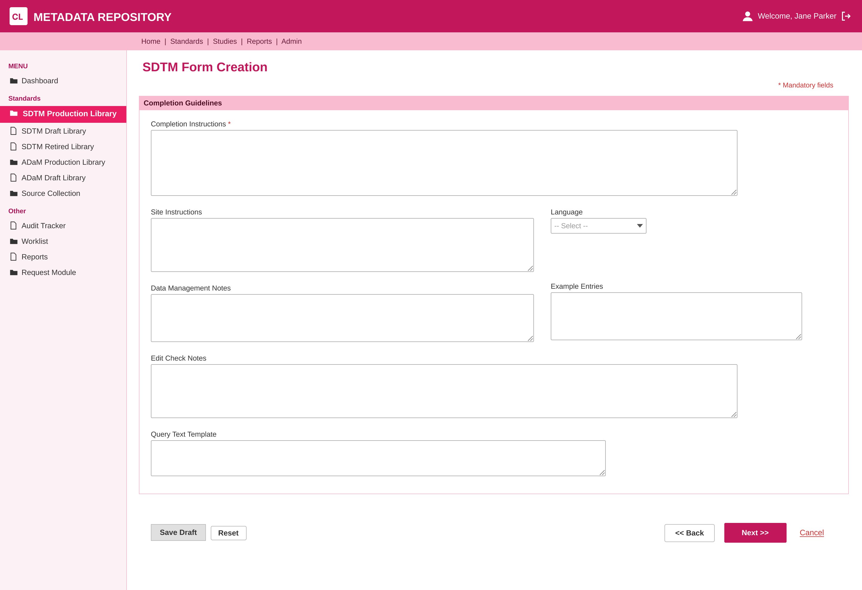
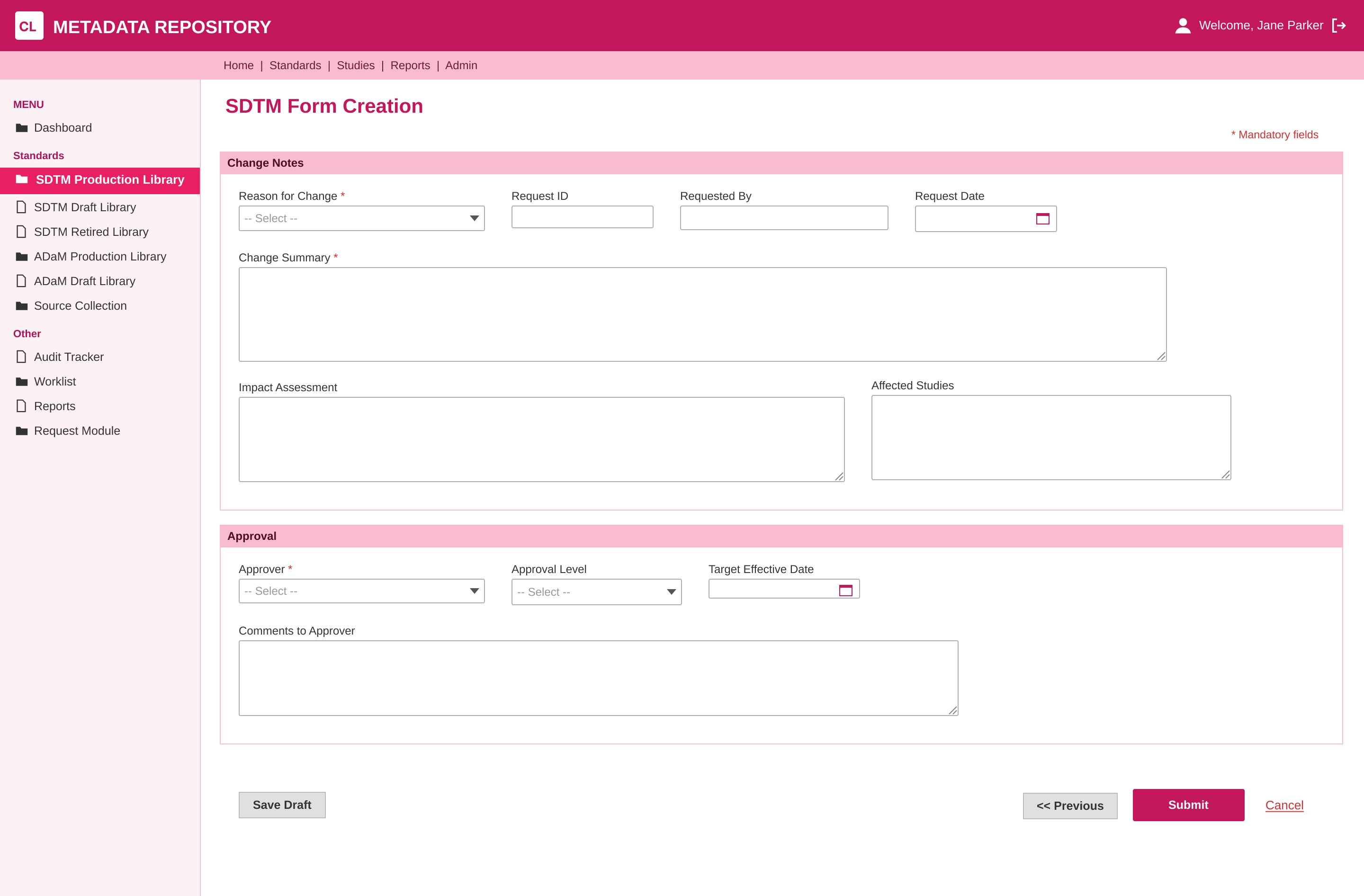
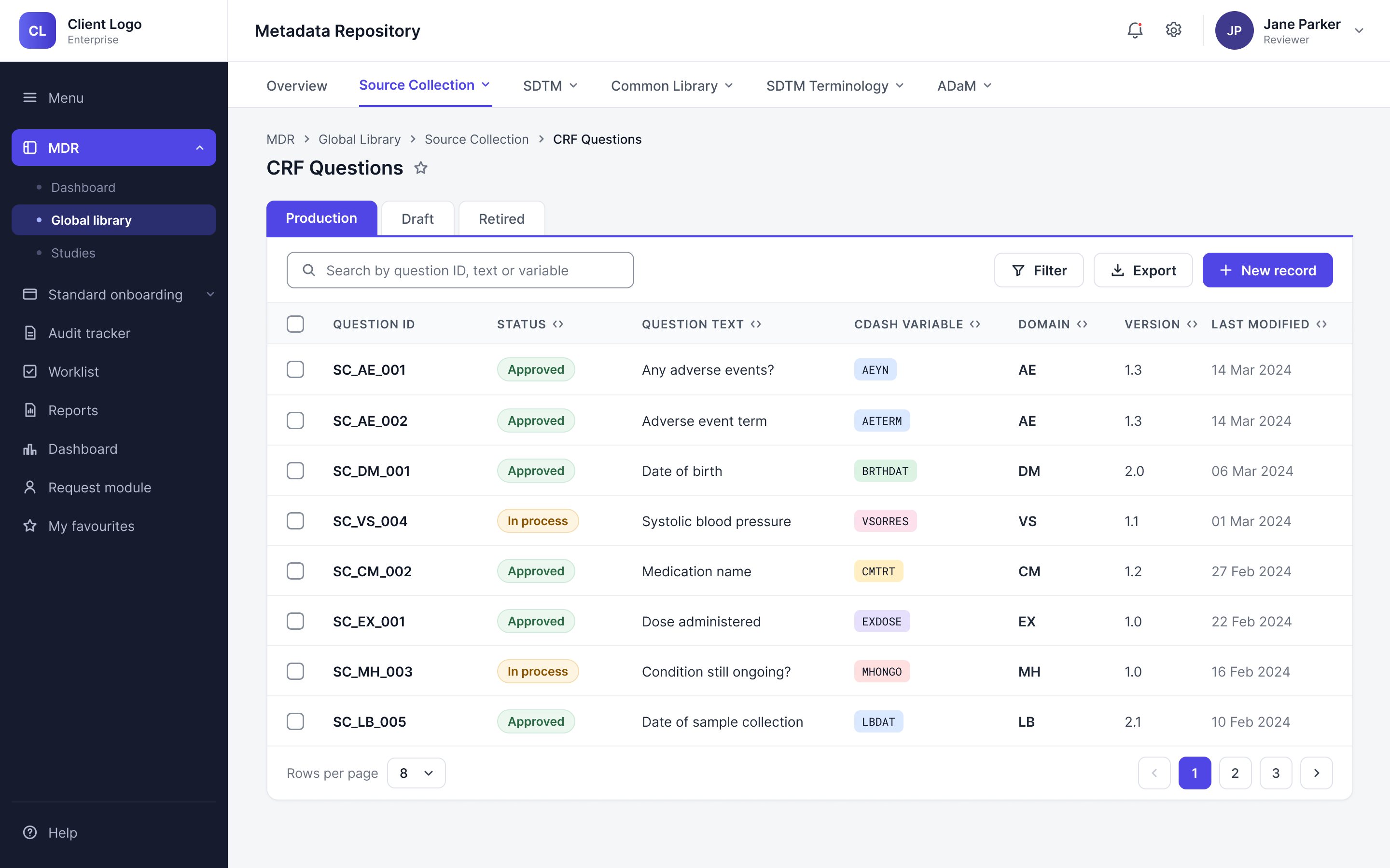
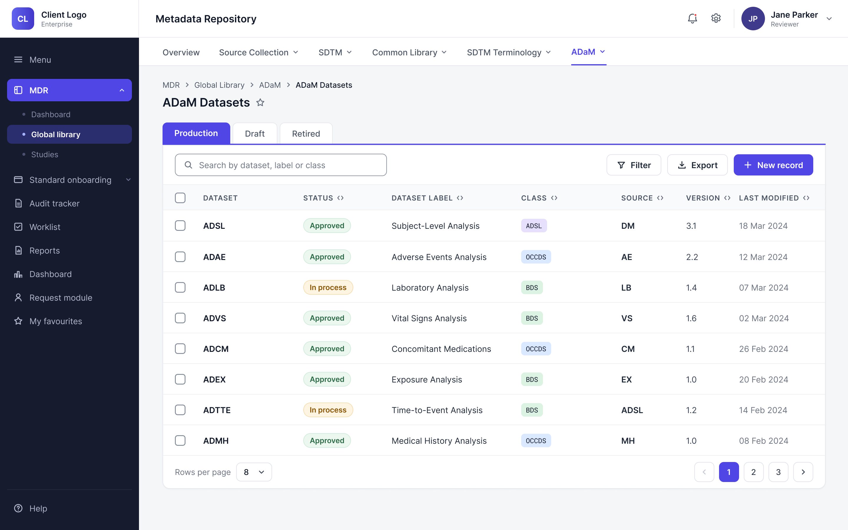
Every module shares the same template and breadcrumbs, so you always know where you are and how to get back.
NDA · Client unnamed · Screens re-rendered · Decisions, constraints and outcomes unchanged
Before a clinical trial collects its first patient record, someone has to decide exactly what it will collect: every form, every question, every code. At a global pharmaceutical company, that work happens in this metadata repository, which had grown module by module into 20+ modules and 360+ screens, each built its own way. Over 14 months, I co-led its redesign with one other designer, not to add features, but to make it one calm, consistent tool on desktop and on a phone. Today, creating a record takes 33% less time, and the platform has been recognised with two India Pharma Awards.
Beyond the screens themselves, my part was shaping the redesign end to end, from understanding how people actually worked to making sure 20+ modules held together as one product. The module-level design I shared with the other designer.
When I spoke with the people who use the repository, their work came down to five things: creating, editing, copying, filtering and searching records. The old tool made each of them harder than it needed to be, and the same four problems came up again and again.

Rather than adding more to a tool that already did too much, we focused on creating a system that simplified all of its data. We addressed each problem in turn, and together those fixes turned 20+ modules into a single, steady product.
Every module shares the same template and breadcrumbs, so you always know where you are and how to get back.
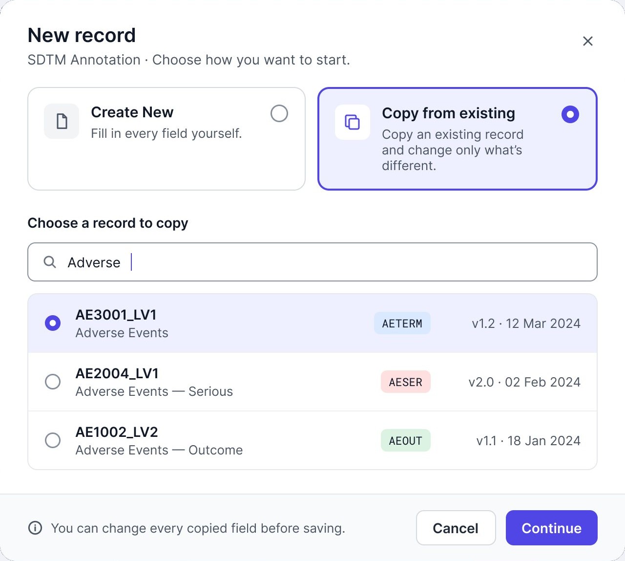
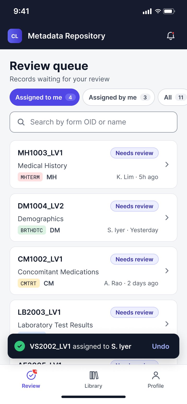
On a phone, people review, approve and assign in a few taps. Creating stays on desktop.
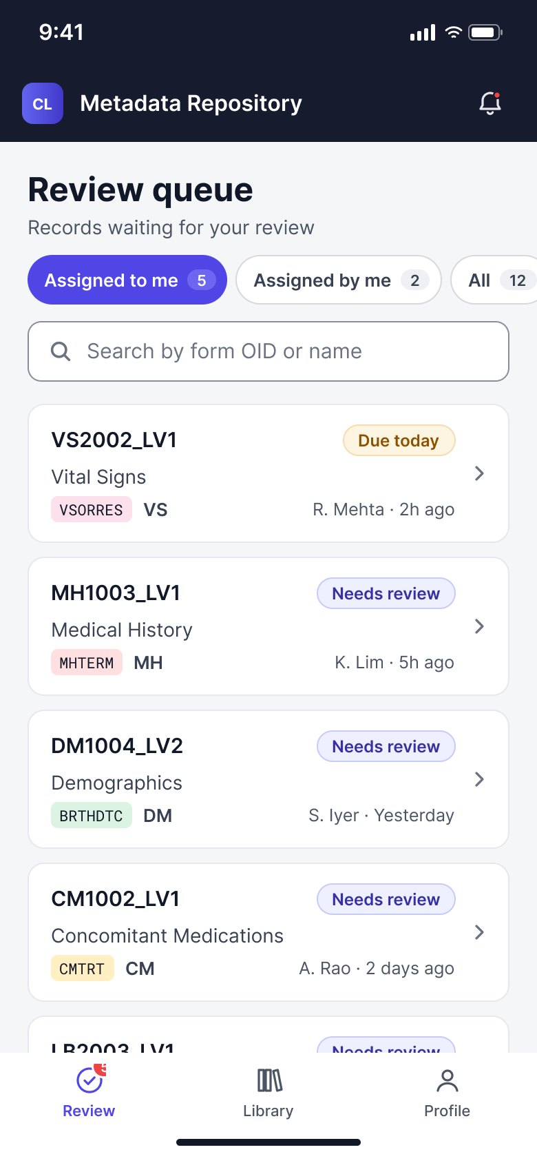
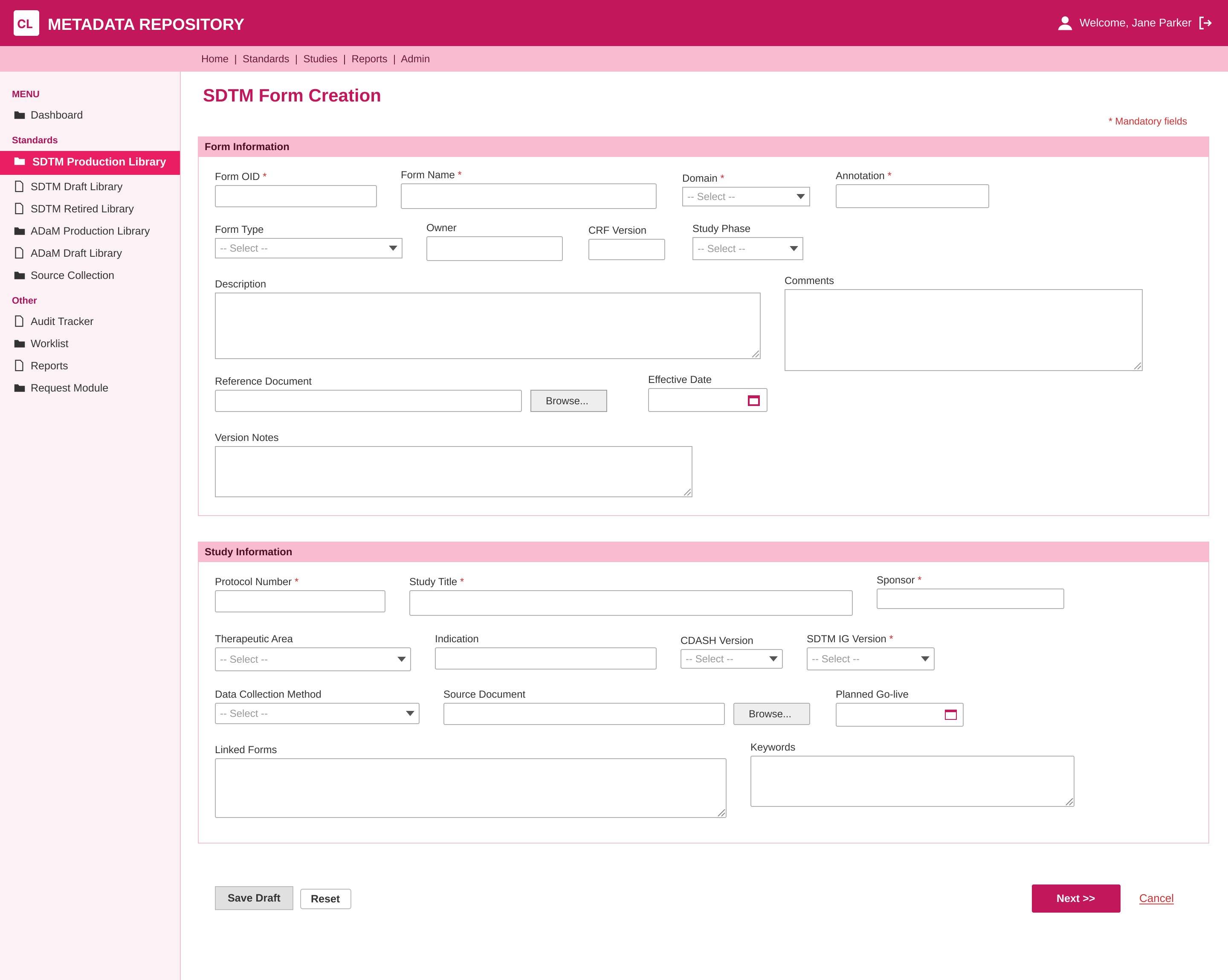
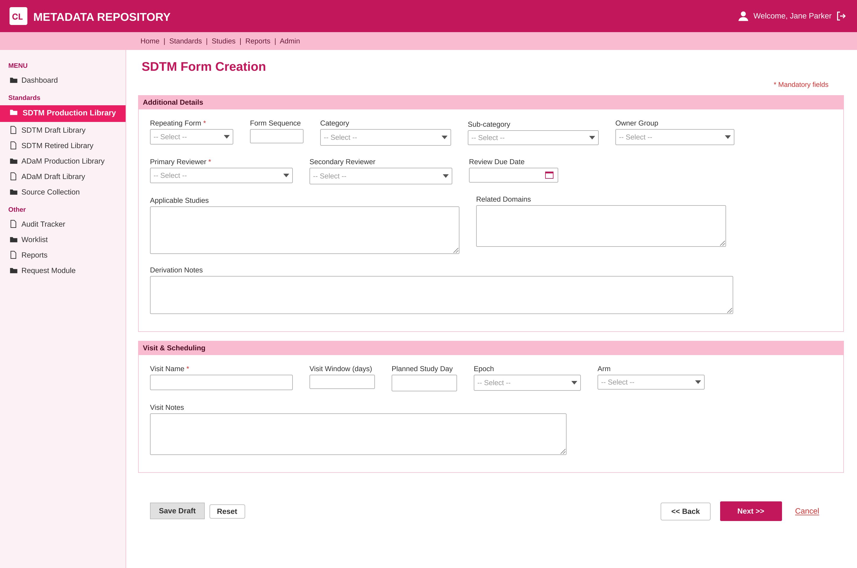
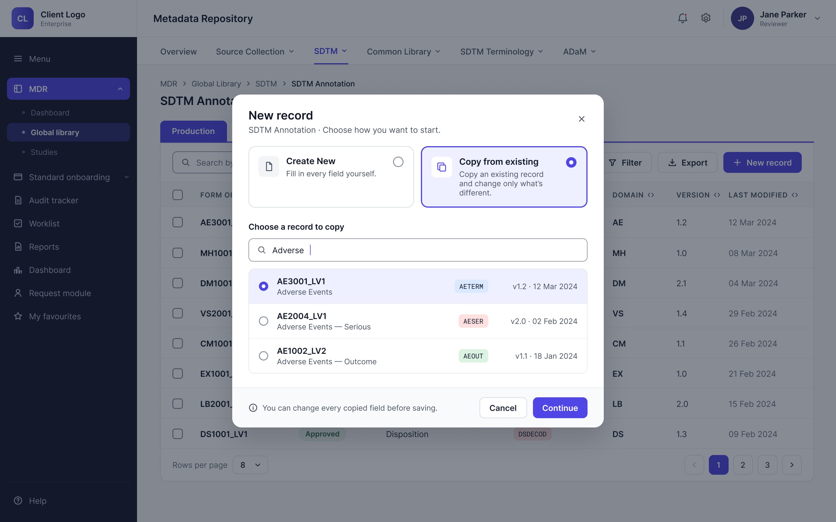
Instead of a blank form, a new record begins from an earlier one, so people only change what’s different.
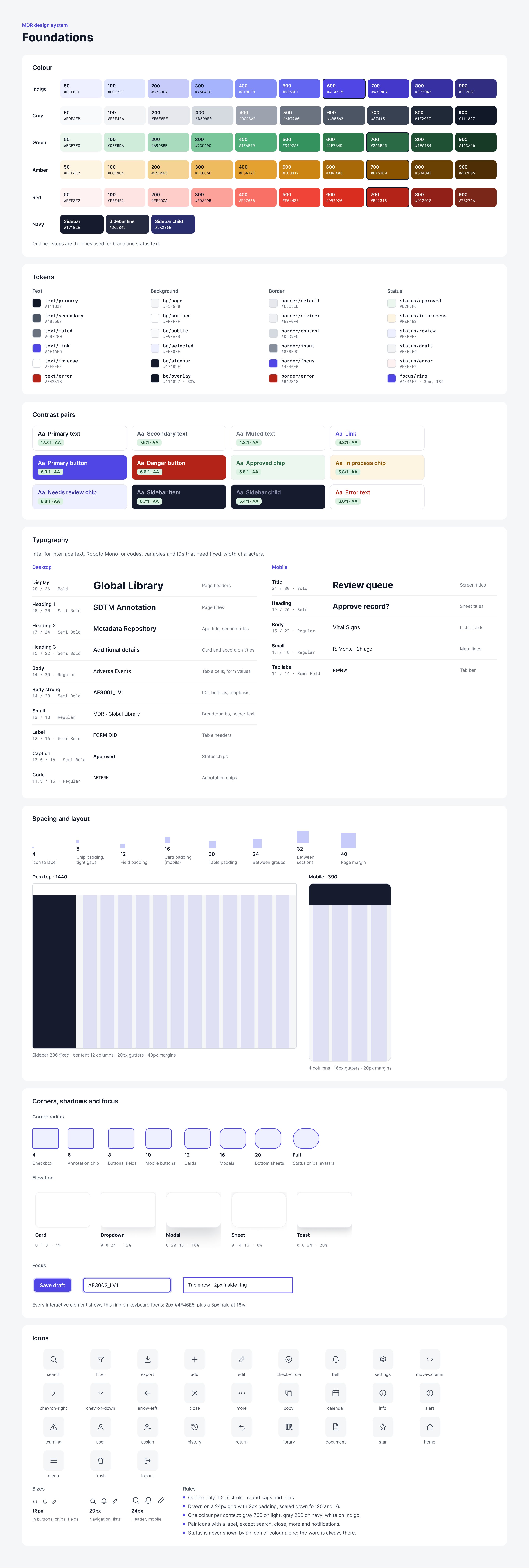
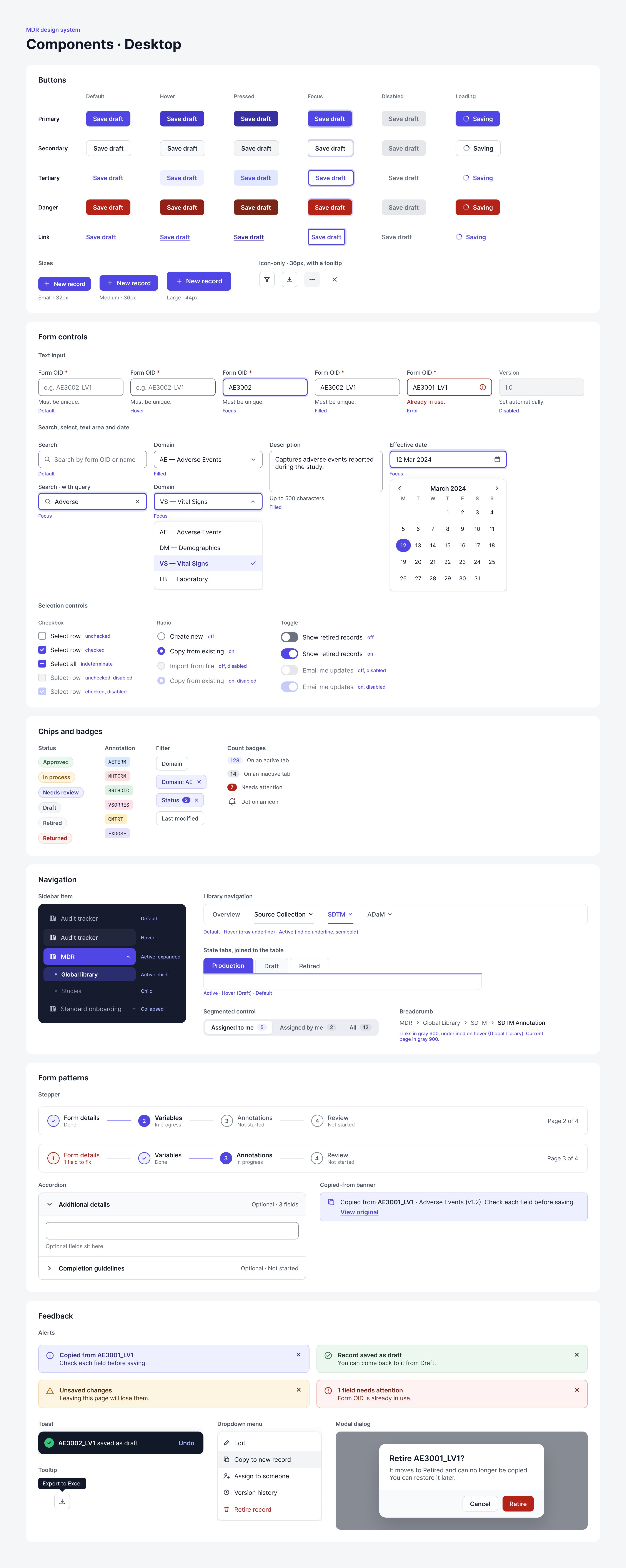
Every screen is drawn from the same tokens and components, so the product looks and behaves the same everywhere.
I built the foundations and components that all 20+ modules are drawn from, from colour tokens to form patterns.
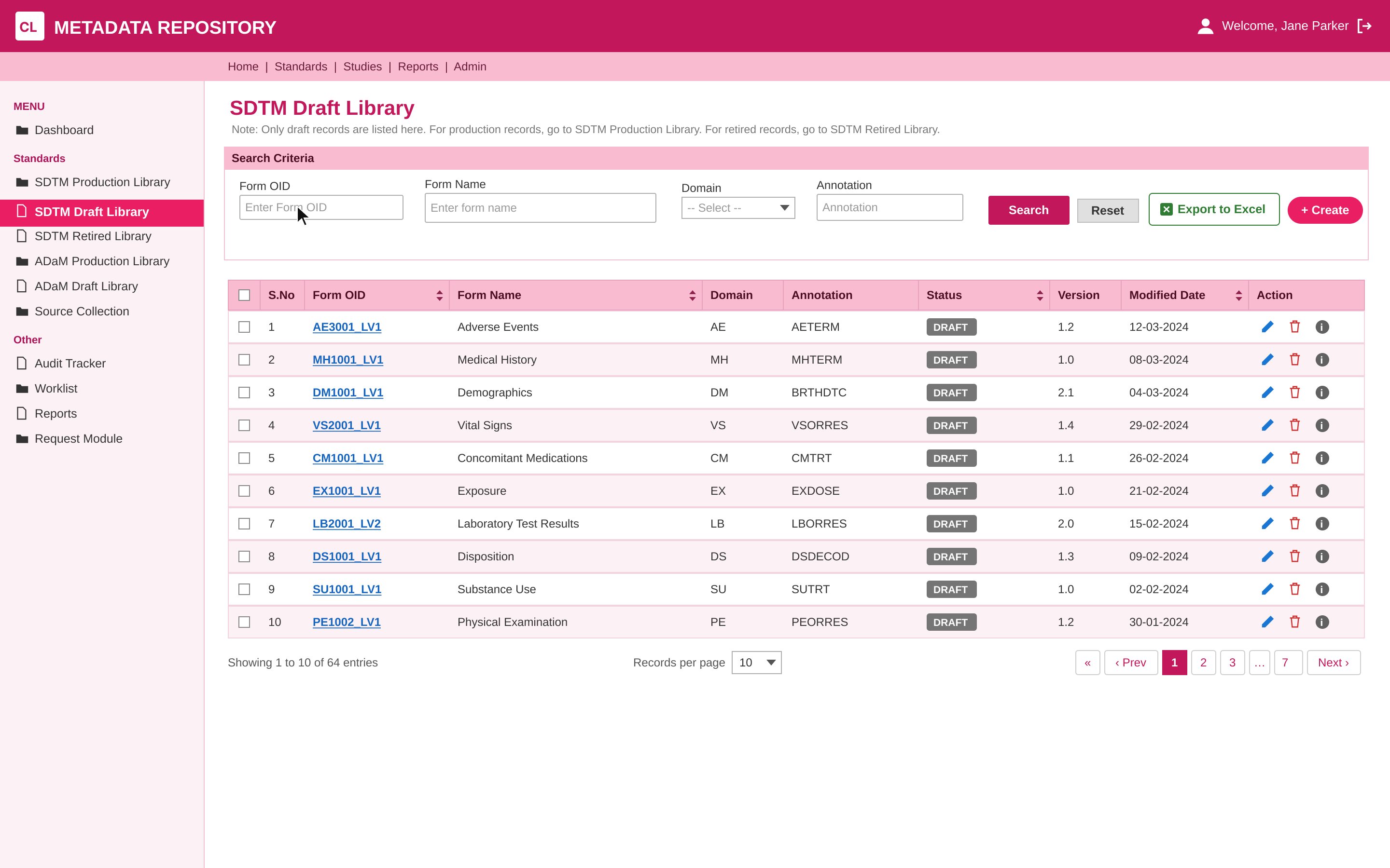
Every module now follows the same template, with breadcrumbs and a persistent header. Whether someone is in Source Collection, ADaM or SDTM, the page works the way they expect.
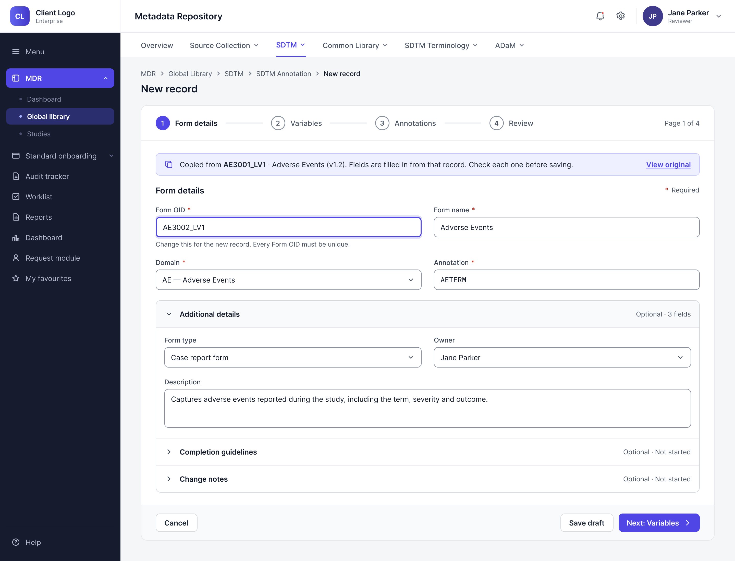
Most new records started as copies, so I made copying the main way to begin. People choose an earlier record, change what’s different, and the form checks anything that must stay unique. Form creation time dropped by 33%, from 12 minutes to 8.
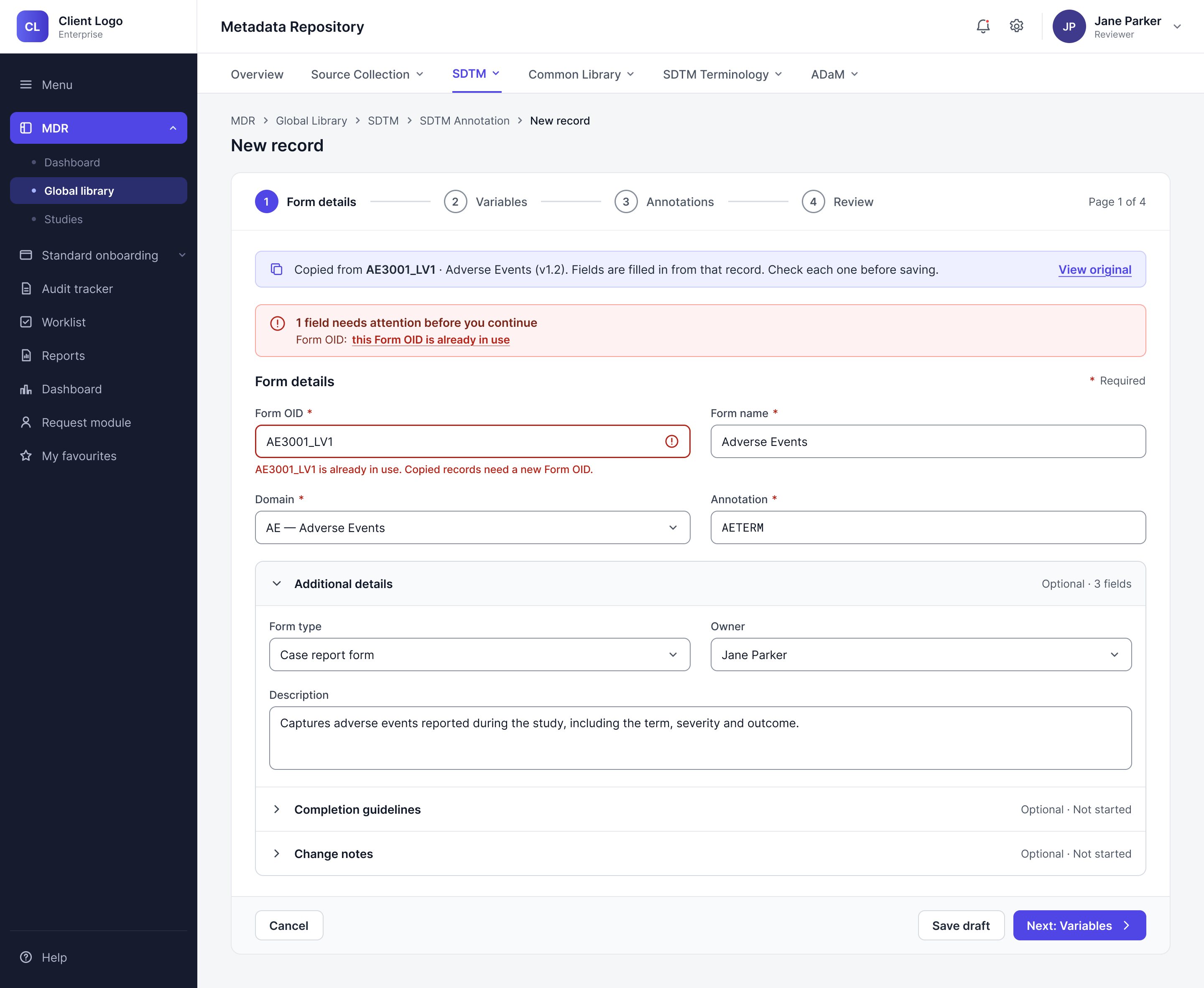
Rather than squeezing everything into the mobile version and making it feel more complicated, we focused on time-sensitive tasks such as reviewing, approving and assigning.
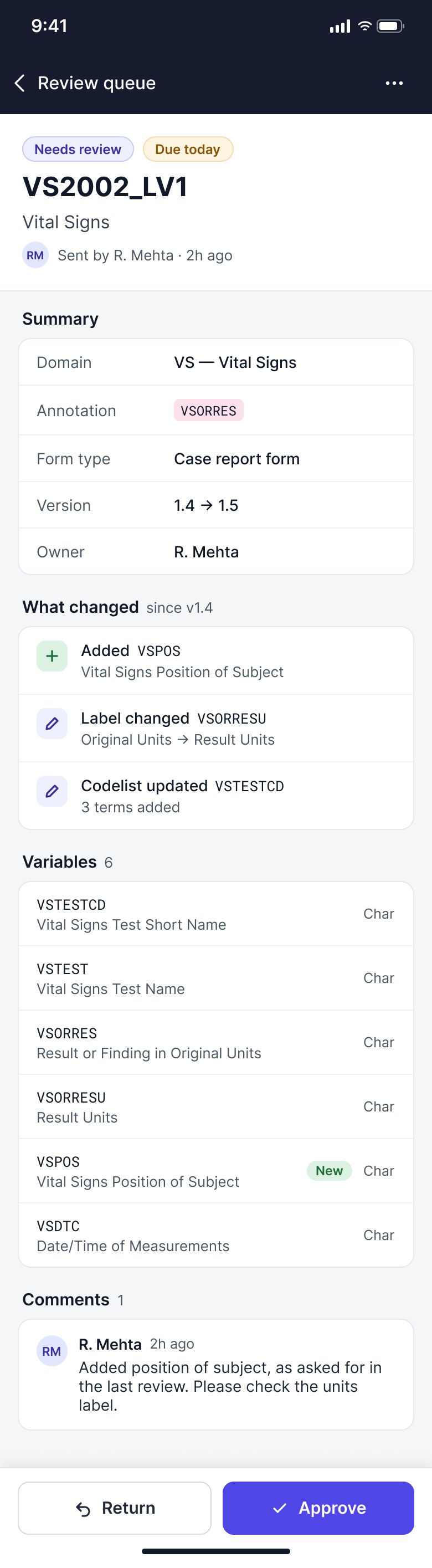


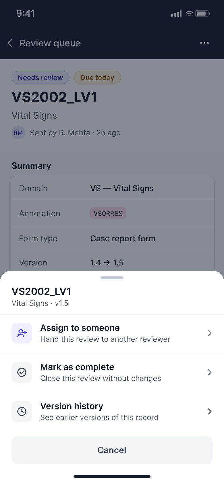
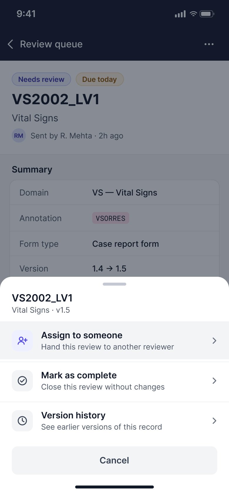
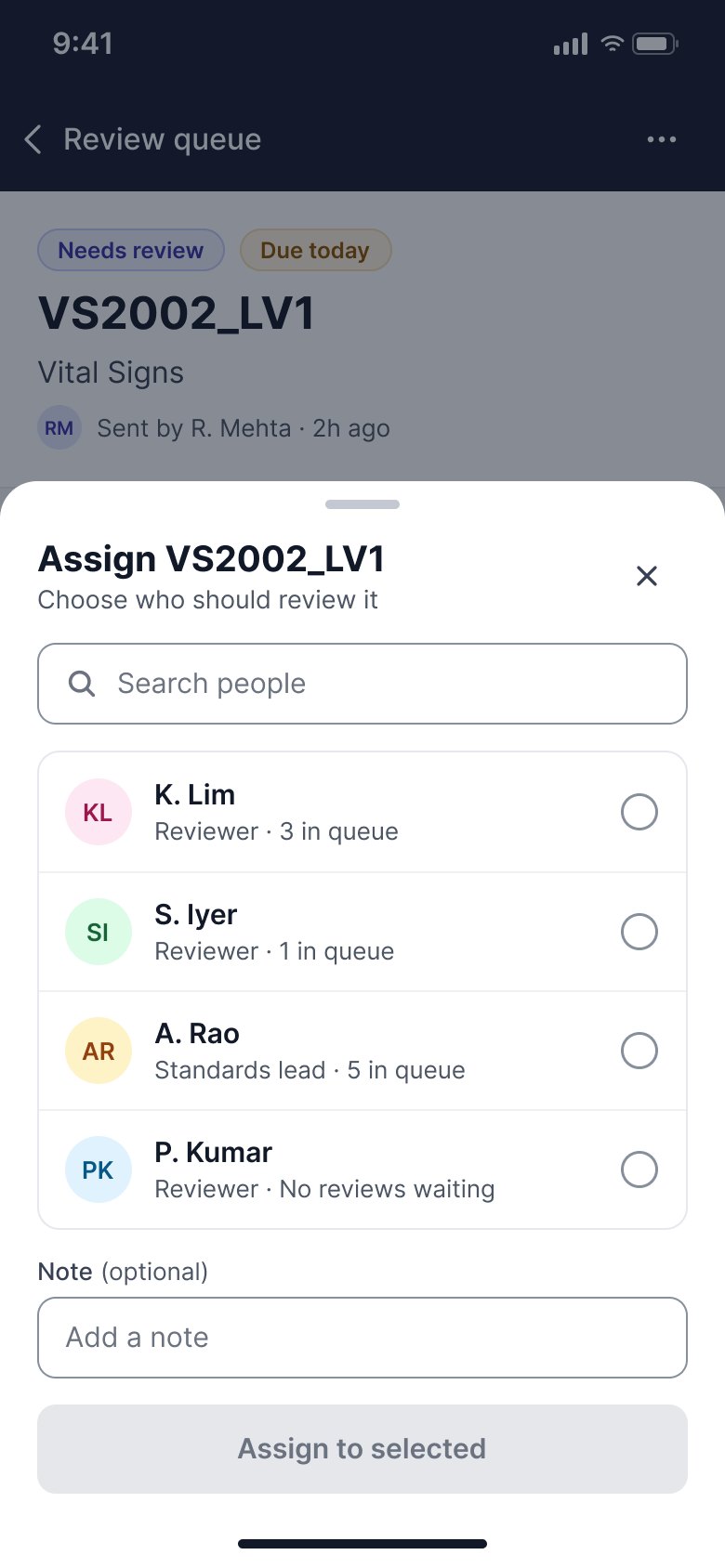
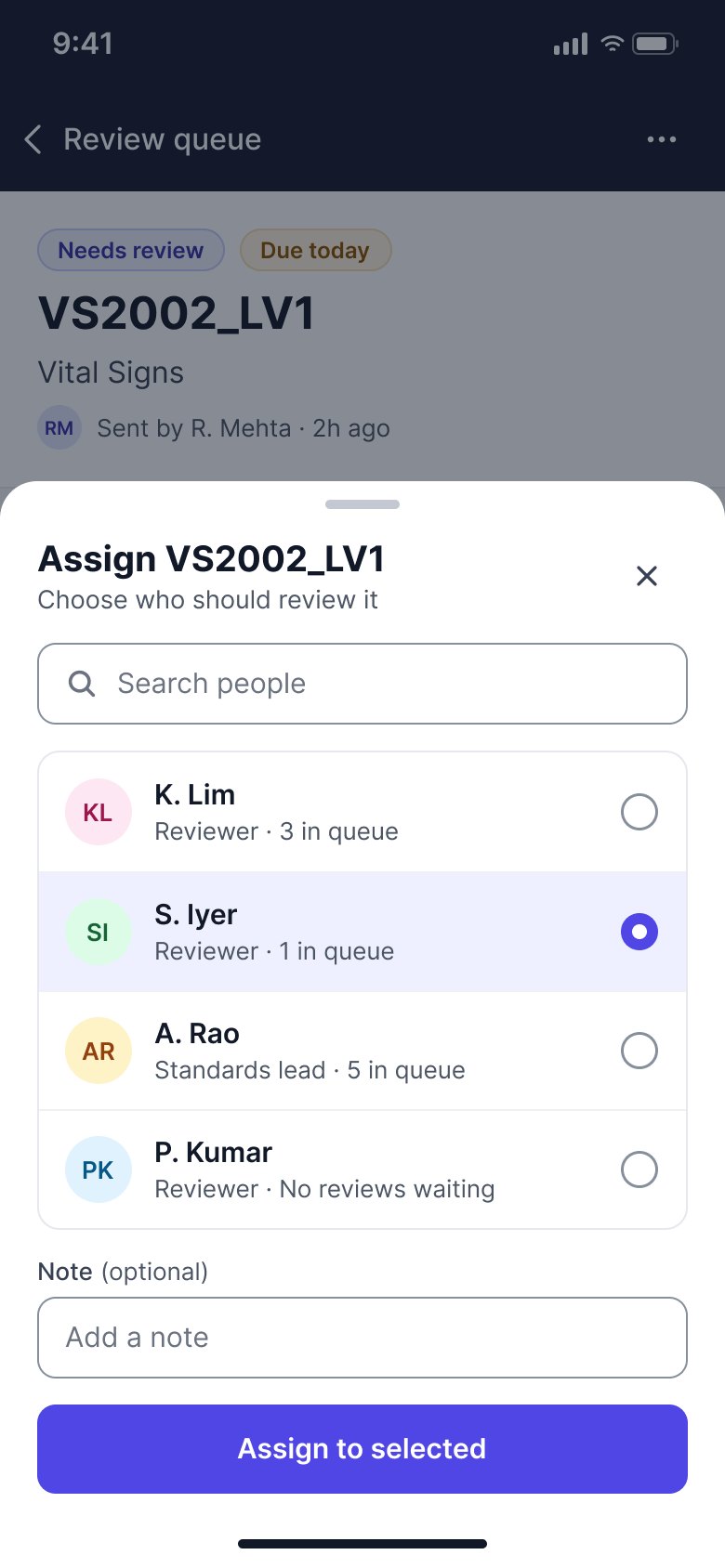
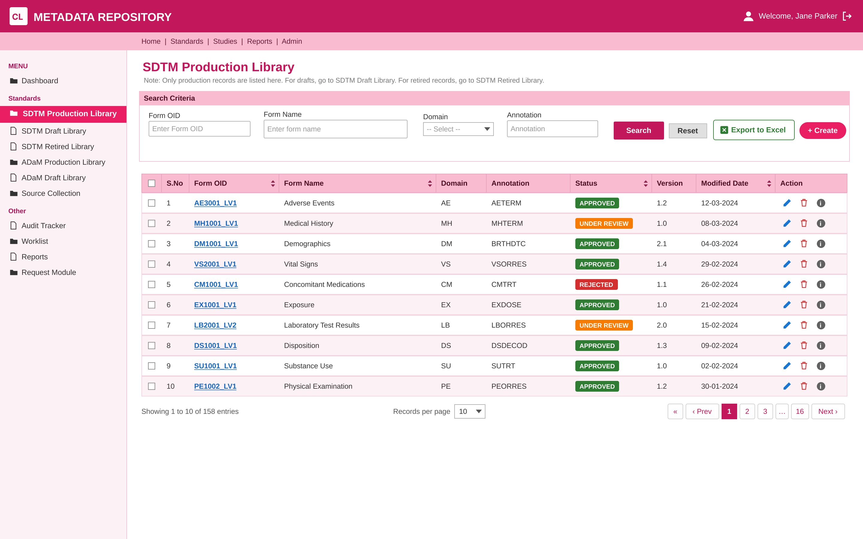
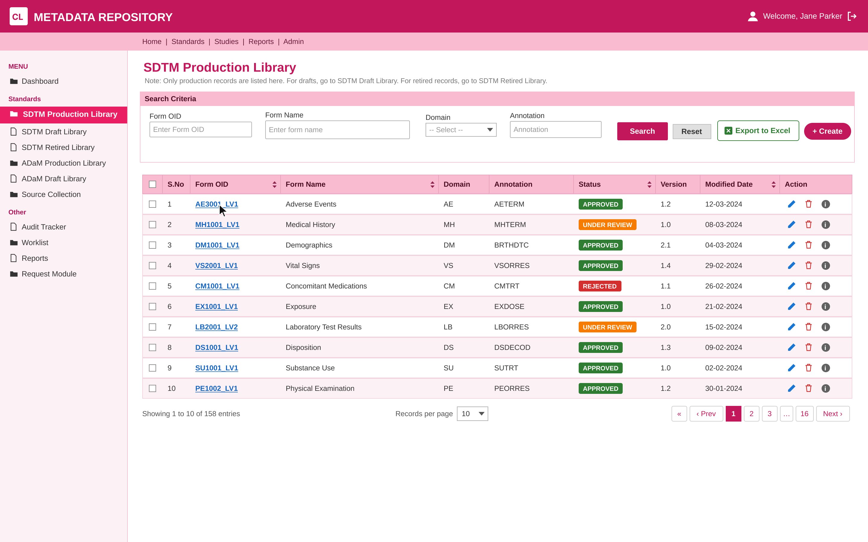
The library people opened every day, before and after the redesign. Drag to compare.
BEFOREAFTER
Fourteen months later, a tool that once felt different in every corner works as one product, and the difference shows up in people’s everyday work.
Reduced form creation time by 33%, from 12 minutes to 8, giving people back the time they used to spend retyping
20+ modules and 360+ screens now work as one consistent platform, built from a single design system
Two India Pharma Awards recognised the redesigned platform for the client
Two TCS Excellence Awards recognised my part in it, across product strategy, information architecture and the design system
Next time I’d roll it out module by module. Changing 20+ modules in a single release asked a lot of people who had used the old tool for years, and a gentler rollout would have let them learn as they went.
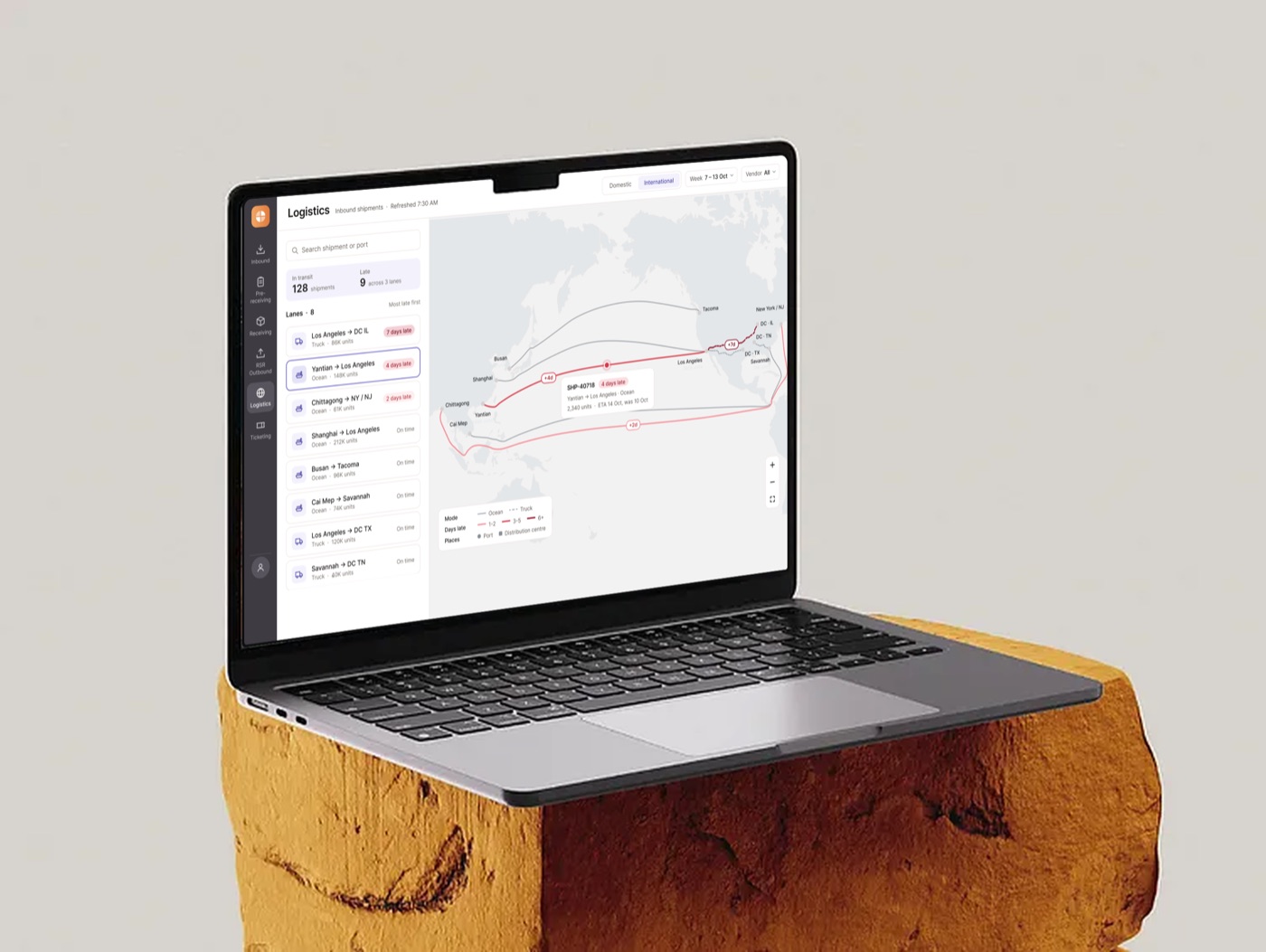
One suite of dashboards that replaced spreadsheets for a global retailer’s logistics team.